 Coke products across the world are getting a makeover, a move that marks the biggest design change in Coca-Cola’s 130-year history.
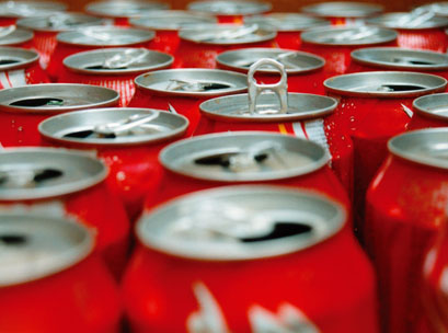
The move to a master brand approach will see all varieties using Coke’s iconic ‘red disc’ design.
It’s the first time the brand’s visual identity will be shared across not only all media, but all Coke products across the world.
Speaking at an event in Sydney today, James Sommerville, The Coca-Cola Company’s vice president of global design, shared the story behind the makeover.
“The red disc, which has become synonymous with the brand, first appeared in the 1930s and became the inspiration behind the biggest redesign in Coke’s history,” he said. “This was about reinterpreting the past, but taking it forwards to a new space.
“When applied across packaging, retail, equipment and experiential, this new approach becomes a global design language that utilises the red disc icon to present the range of products available today in a contemporary and simple way.”
Lisa Winn, marketing director for Coca-Cola South Pacific, said with the launch of Diet Coke and other varieties the brand has really drifted away from the ‘iconic red’.
“We realised we were in danger of losing our iconic colour in a sea of other colours like silver, black and green, and we knew we needed to reclaim it as an icon of our brand,” she said. “That is one of the primary ideas behind the new design and the global one-brand strategy,”