 Baby food company, Rafferty’s Garden, has undergone a complete rebrand including its logo, packaging, and Rafferty baby character.
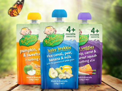
The redesign was created by strategic design consultancy, Boxer & Co, with the agency rebranding the Rafferty’s Garden logo, re-working the Rafferty baby character, creating a new pack design to apply across all 53 products, and creating brand guidelines for future use.
The redesign follows the sale of Raffery Garden’s, which was acquired by British consumer products company, PZ Cussons Group, for $70 million in 2013. PZ Cussons Group’s other brands include Morning Fresh, Duo, Radiant, Five:AM, Fudge, and St Tropez.
Mark Haygarth, creative director of Boxer & Co, said Rafferty’s Garden had great stand out with eye catching colours, but very little beyond this to help brand blocking and navigation.
“We decided early on that we needed to respect the essence of Rafferty’s Garden, retaining the joy, fun, and realness that the brand represented, but it needed to stand up and punch at a heavier weight,” Haygarth said.
“We needed to introduce a consistent brand colour across the range for greater impact on shelf and give Rafferty and the logo a stronger role on the pack to aid instant recognition and brand recall.
“The joy of food message is reflected in the vegetable coloured splats on each pack and the new, more artisan, illustrative style of the Rafferty character. We introduced food photography to give taste cues, since this is genuinely the best tasting baby food on the market.
“We realised that the age and food type information in the top right hand corner is almost as important as the variety name, so introduce an easy to navigate system, making it easy for busy mums to shop. We worked hard to make communication in this area as clear and concise for busy parent shoppers as possible, making the month indicator much bigger. We increased brand stand out and introduced an architecture that allowed for both brand and variant areas.”