 Everyone studying grocery and big box retail looks to the usual suspects; Tesco’s vertical retailing, Costco’s member model, Amazon’s customer first strategy, and many others I could name.
Over the new year I discovered a new best practice grocery experience in Rio, one which is achieving an instore experience that balances digital assistance with a truly enjoyable shopping environment.
The two retailers that best epitomised this new best practice were Hortifruti and Pao de Acucar.
The Hortifruti store I saw is a small format store delivering a tight but inviting grocery mix alongside a very comprehensive fresh produce and protein range.
From the front of store you can see across the entire floorplan because the most noticeable feature (for an Australian shopper) is low shelving.
Enter to the left and you enter the premium grocery aisle. The wall fixture looks wooden giving it an inviting presence; it draws you in. The aisle fixtures are tiered, unobtrusive pods, which look great and allow the shopper to explore freely and intuitively.
Mirroring these shelves on the opposite side of the store are fridges that are also tiered and slimline.
From there you enter the fresh section, which uses light weight fixtures that resemble a semi- permanent market set up. Clean bins are found under the shelves so people can pick and trim their own selection.
Staff use compact, neatly stacked trays on wheels to replenish, these like the shelving feel market style. But none of the market look and feel takes away from an overall impression that you are in a good grocery store. It is an active environment.
What delighted me was to see the integration of digital ticketing that is effective and subtle. I suffer daily from screen overload so I am particularly sensitive to seeing more digital touchpoints in my day, but this solution is perfect; low light and simple rather than embellished and flashing.
Accompanying the digital tickets in fresh is interesting product information that tells you what is the best use and best way to cook the produce.
This enjoyable space encourages exploration and immersion of the senses. It gets you excited about food!
So the challenge is, can a small format experience be topped by a big box experience where it is harder to manage the visual merchandising and replenishment?
Pao de Acucar certainly gives Hortifruiti a run for its money.
Pao de Acuar is two blocks away and occupies a significant corner location. Normally I am a huge advocate for designing a store to meet the street, meaning windows and lots of them. This store has none and surprisingly once inside, it doesn’t matter.
The light is carefully managed with pockets of light and shade making it feel natural.
Enter the fresh section and you enter an endearing arrangement of colourful, wooden fixtures in pod- like sections. The fruit and vegetables are overflowing and slightly undone, rather than structured and perfect.
Vignettes of visual merchandising such as a wooden wheelbarrows and baskets create visual features to accent the customer journey.
From there you walk into a food for now section. A café kiosk serving coffee, ready to go lunches, and a pizza oven service a small seating area. On the wall is a sushi and juice service. It is simple and comfortable, lacking all the mass production vinyl of many big box retailers.
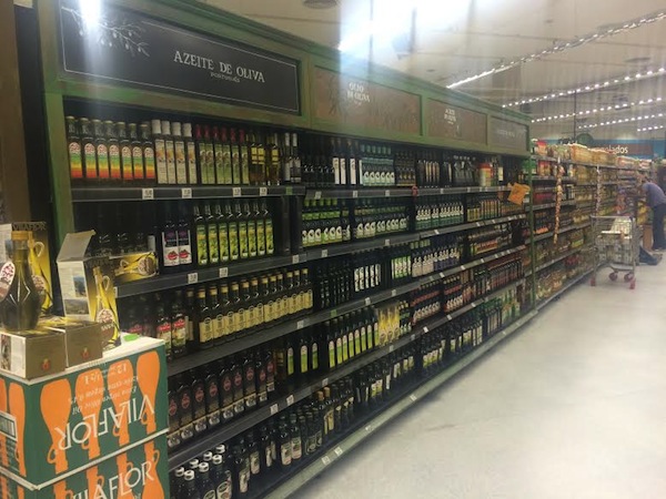
This store doesn’t shy away from pumping the volume, the shelves are high, however, they are not uniform, which gives the customer journey visual and ambient stimulation.
For instance the premium small goods section uses wooden-look features and discreet shelf talkers. There is an organic section, that is green and natural, the alcohol aisles are similar to the new concept Dan Murphy’s in Double Bay (brilliant store) and the laundry category uses a more industrial fitting, although still light weight.
Critically, Paco de Acucar has been able to achieve brand consistency amidst all this differentiation of execution instore. If feels cohesive, purposeful, most importantly, enjoyable.
What are the outtakes for new best practice?
- A market ambience does not have to use low-fi touch points to retain its desirability. Done right, digital integration is useful and efficient.
- Light weight fixtures and fittings help to deconstruct the feeling of being over powered that you can feel in some big box retailers where the fixtures overtake the produce.
- Differentiation of fixtures instore does not equal inconsistency of brand experience. In fact it adds to the enjoyment, therefore the engagement with the brand.
- Single tone uniformity and structure instore is the death of humanity. Break free and design for humans who are naturally intuitive and curious.
Clair van Veen is GM and strategist at Designworks.


