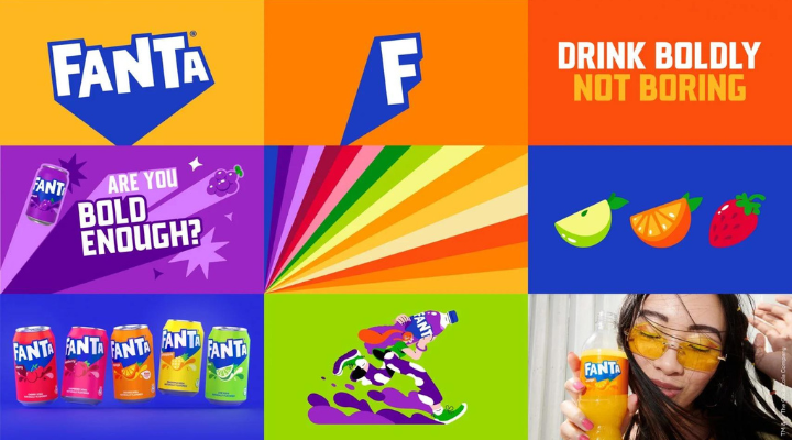

Coca-Cola has given its Fanta brand a major makeover with the unveiling of a new logo soon to be rolled out worldwide.
Led by the beverage company’s design team and creative agency, Jones Knowles Ritchie, the redesign aims to give the brand a “playful image” and a “unified global identity” based on fun.
Rapha Abreu, global VP of design at Coca-Cola, told Dezeen that Fanta is one of the portfolio’s most playful brands; however, its identity felt too contained and didn’t portray playfulness.
“At the end of the day, a playful brand needs to be truly playful,” said Abreu.

The new design simplified its previous branding and created a stripped-back flat logo. The lettering has been neatened, with shadows removed and the smile-shaped icon from within the second letter A.
At the same time, a lighter shade of blue is used for the thick shadow, extended downwards to form a point.
The design team also removed the orange rondel and leaf from the logo.
“It was confusing to have an orange in it when we have a range of flavours that go beyond orange,” Abreu continued.
In addition, as a brand first, Fanta’s new logo will be used in all countries, replacing previously different designs in different regions.
“We decided to redefine for every market and ensure every team was applying the same elements so that we could truly unify under one global identity,” said Abreu.
He hopes that the global rebrand will unify Fanta’s identity and stop any more redesigns from happening for a long time.
“Fanta has had many different changes over the years, and the biggest challenge was that we wanted to stop that,” he concluded.
“Fanta is all about fruity tastes that come in all different flavours, and this is an identity that brings that to life.”
Fanta’s rebrand follows rival beverage company Pepsi’s recent logo redesign.